Showing posts with label joshua calloway. Show all posts

Friday, March 22, 2013

How to Make a Book Cover for Dummies


What’s woody, grasshoppers?

Play the video above to get your groove on while you read the breakdown of Thick 3
 

This week I unveiled the book cover for In the Thick of Things aka Thick 3…the story itself is only 5 percent done…I’m taking my time with the story because I want THIS one to be special….
 

…kinda like how you continue to sleep and hoe around until you find the RIGHT person to settle down with
 

Anyway…I purposely posted the book cover a year before the novel’s release date to motivate me to finish the project
 

The visual helps out the king with the content of the story…besides the provocative nature of the book covers in the Thick series (half nakedness DOES help), they give me an idea of how I should approach the story…the better the book cover looks to the public, the better I write the story to MATCH the intense beauty of the visual before you pick up a copy
 

And for the record, I’m NOT the illustrator of the book covers…the artwork is done by Joshua Calloway, straight from the mean "skreets" of cornfields and cheese factories of Wisconsin USA, baby
 

Check out his work @ www.jacart.org
 

I hand picked Joshua to work on the book covers of Thick 2 and 3…I fell out with the illustrator of Thick 1…I was an asshole to Zach, but shit, I play hardball when it comes to projects that need to be done
 

I can be VERY anal about how I want the book covers to be executed...real rap
 

Shout out to Zachary Schoenbaum…check out his work @ www.umbralust.com
 

I emailed Joshua about a one-week book cover project for Thick 3…he agreed, and worked from the material I’d given him…I specifically told him I wanted yellow to dominate the illustration, just like how red dominated Thick 1 and orange dominated Thick 2
 

Thick 3 is also known as the "yellow book"
 

Joshua went to work with the first draft of the cover…the watershed style is used right 'chea on some Leonardo da Vinci type shit…I switched things up so the book covers won’t look the same from the other Thick novels as well as other books in today’s market
 

A week after our initial emails, Joshua hit me off with…


I wasn’t feeling it…the drawing wasn’t wack…it was just…
 

…eh!
 

The illustration didn’t make my dick hard…I told money (Joshua) to make her face smaller, sharpen the nose, make the lips fuller, fix the index finger, and put some red in the illustration to contrast with the yellow
 

Money headed back to the drawing board with this…


We were right on track, baby!

The wrinkles from the brush strokes of the painting didn’t sit too well with the king…they made shorty look old in the face...like "Jesus is my homeboy" old...I told money to smooth out the lines in the painting and add the background I gave him
 

He hit me off with…


Nice…nice…niiiiiiiiiice
 

Actually, Joshua had sent me two versions of the book cover: one with a sun, and one without…I wanted the sun to have an “Oh shit!” facial expression as he’s lookin’ at shorty…Joshua thought that shit was weird…I didn’t give a fuck, I wanted that joint in the painting
 

I told him to make the size of the sun smaller, add a red strand in the middle of shorty’s hair, and add the book title in the painting for this…


The cover was dope, but I wasn’t wholeheartedly satisfied…I didn’t bust a nut from the illustration
 

I suggested that money make the woman a little bit smaller, make “In The” that rides the T in THICK look much bigger, and put his own swag to the finished product since we had an extra day until the deadline
 

I hate using the word “swag,” but I’ll let it ride for once this time
 

He cooked up the final project in the kitchen and hooked me up with what you now see


I wish I knew how to draw as great as I can write…that'll save me some dough...LOL...straight up...drawing cartoons were my first passion as a shorty standing knee high…I couldn’t draw a lick, so I wrote episodes instead
 

Every cover of my books are conceived by me…I hire artists to carry out the images I possess in my mind…I’m the conductor in the orchestra of art
 

Simple as that
 

There’s actually more to the creative process of this illustration than I’m giving away…the process is tedious; it takes longer than expected…but hey, it’s worth it
 

I treat book covers like album covers…even if you think the story suck, at least you can’t front on the cover…I want people to buy the book based on the cover ALONE
 

And also for the cover to become timeless while the clock runs laps around this small, cold world like it’s on crack

Aight, ya’ll…I’m out
 

Peace

Nah’Sun the Great @ www.nahsunblaze.com


Thursday, March 21, 2013

Book Cover for Thick 3

What’s woody, grasshoppers?
 

There’s nothing much for me to say

The book cover for In the Thick of Things aka Thick 3 speaks for itself
 

You either gonna get under the wing…
…or get under the ring


2014 and beyond, baby pa


Peace


Nah’Sun the Great


Thursday, April 26, 2012

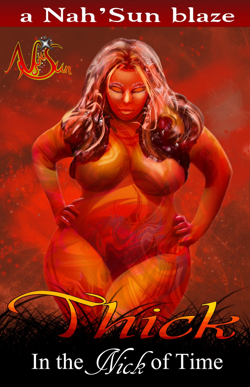
The Making of Thick 2 Book Cover


Uh oh…it’s that time again

It’s that time to break down the book cover process…I’m gonna make this brief…Arm wrestling with the hands of time is draining …heck, I’m surprised I have time to draw up this blog

The show MUST go on

Aight…so I wanted a frontal image of a plus size woman…the illustrator for the original Thick book was missing in action for whatever reason

Shout out to Zach…where ever you are…hope all is well with you

Not getting a response from Zach through email had led me to hit up another secret weapon…Joshua…

I was kinda hard on Zach during the process of my Nah’Sun logo and the book cover to the original Thick…but hey…I want my shit done right and exact on the strength of how I see things

Make a long explanation short, I told my new illustrator, Joshua, what I envisioned for the one week assignment…he drew up a quick skeleton before going all the way in

  
That’s the skeleton of the original figure…Joshua felt that the woman needed more attitude…I’m not the type to put a lid on my illustrator's creative juices…so I let him do his thing

I fell back and wondered what he’d cooked up

He came up with…


The drawing was dope…I told him to take out the purple in the hair and parts of the body because this is the ORANGE BOOK of the series…Thick When the Chances are Slim is known as the RED BOOK

I’m tailoring my book covers of the Thick series to the Chakra…I might talk about the Chakra in a later blog when I have more time on my hands

Anyway…I told Joshua to take out the purple, and take out the black lines that separate the body parts…WIDER HIPS was also needed

Yep…I love wide hips…POW!


The changes were on point…I wanted a spaced out background…since the woman is the Queen of the Universe, I thought an orange spaced out background was fitting for her existence on earth (the black grass in the bottom of the book represents the earth)

I wanted the book to have an orange theme for the background…he went back to the drawing board and came up with…


Too red

Aight, chill…no worry

I told money about the red background…stubborn minds led to this…


Leave it to me to help out the sport...this version kinda reminds me of Storm from the X-Men

I didn’t wanna stress my guy over a minor (but major) part of the illustration…it’s not about getting angry or panicking over the small stuff…it’s about helping those who are helping you

The old saying of “one hand washes the other” when you’re on a team is perfect for a great outcome instead of acting like a dick at the first sign of trouble

I searched around for some orange coloring I wanted for the background…I found a few and sent the 3 bottom photos for him to work with

Color for the author header block

Shading of the background

main color


He thanked me for the alley oop and slam dunked my vision for the background

Heads kept asking me “what’s her race?” because of the heavy facial features on the drawing…Joshua faded out the facial features to leave her vague…He also used blends and shadings to separate the body parts instead of black lines to make the drawing appear more artsy

The black lines would’ve restricted the flow of the illustration…he obliged and cooked up…

The Finish Product
That’s what I’m talkin’ 'bout

As you can see, coming up with a book cover that reflects my original intent is a process itself…I’m not a believer of slapping anything on the cover just for the hell of it

I treat my book covers like artists back in the day treated their albums

And guess what???

The book cover ACTUALLY has something to do with the story...SHOTS FIRED!!!

Aight, ya’ll…I’m Audi 9G

Peace

Nah’Sun